Wednesday 5 December 2012
Friday 10 February 2012
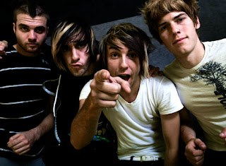
Directors Commentary - Task 4
Evaluation Comments for Director’s Commentary Evaluation Task 4
My Medicine – Natalya and Laura
Excellent and considerate understanding of the technologies used in production of the video. There are evident links between creative decision making and use of technology on both productions of the video using professional digital cameras (e.g focus pulls) and in the post production editing process – in discussion of continuity. This is sustained and thorough and accurate in discussion of the propaganda themes of the MV. The commentary shows a discrete awareness of the use of new media technology and uses discriminating examples really well. Excellent command of terminology and well presented.
Covers sound and technology. Exemplifies Photoshop well and the use of projection equipment and stop motion as an effect. Excellent commentary, well done.
Thursday 9 February 2012

How did you use new media technologies in the construction and research of your digipak and poster?
Digi-pak
The construction of our digi-pak began after we had established as a group what song we were going to produce a music video on and the genre/style of the band. Theoretically the design decisions were all based on the genre of the band seeing as different codes and conventions are used for different genres of music.
Firstly, we decided to title our album ‘Burn Out’ which would feature the song ‘My Medicine’ on it. This is when new media technologies came into use during the construction and research stages of our digi-pak.
By using online fan based sites such as MySpace, Facebook and Twitter I was able to compile different design elements that I would be able to incorporate in our own designs. Initially I had designed a simple logo using the band’s initials DR (Damned Reputation) and placed them in a red circle to represent a flashing red record button to link into our concept of the band filming themselves in the music video.
However, I then decided that I wanted to make the artwork more extravagant. My idea was to place rope in the shape of my initial design and set it on fire whilst photographing the stages of the rope slowly burning out (a basic representation of the album title). I uploaded my images onto the program Adobe Bridge in order to view my images in the same file and decide which were best to edit.

I then opened up Adobe Photoshop CS4, which is image manipulation software, to begin editing my images. I decided to choose an image of the rope burning strongly, and then also an image of the rope nearly burnt out (intending to use the brightly burning image for the front cover. Seeing as I shot my images in RAW it meant that more detail and colour was preserved in the image, resulting in me being able to manipulate the colour to a higher standard.
For my front cover I was not satisfied with how the rope did not make a perfect circle and the ‘DR’ was not very clear. In order to fix this I used the liquefy tool on Photoshop which allows you to distort your image by moving it around to however you please. This was a slightly long process because it involved a lot of tweaking and making sure the circle and lettering was as good as it could be, however I felt that it was important.
Before:
Having edited the shape of the logo and manipulated the colour I wanted to add another component. I decided, again by using the liquefy tool, that I would merge the flames of the image in the center of the logo to create the words ‘Burn Out’. I thought that this might have not turned out as well as it did but I am pleased with the outcome.
After:
Another technique I used on Photoshop was used on the back cover. I decided I wanted the floor I photographed on to cover the entire image, for continuity purposes relating to colour, on the album. So I used the clone tool on Photoshop, which allows you to focus on a single part of the image, clone it, and paste it to another part of the image.
Finally for the back cover text I used the magnetic lasso tool to break up parts of the text and move it around to create a ‘shattered’ effect that I thought would fit in with the genre of the band.
Wednesday 8 February 2012
Poster
Seeing as I designed the Digi-pak first it was easier to design the poster because, in terms of continuity, I wanted the design features to remain similar. However, the design of a poster is different to that of a CD cover so I decided to go online in order to research similar band’s music posters. Again, websites such as MySpace which bands have designed around their own image offered a lot of design ideas that were helpful in this process.
A lot of the posters I looked at were of the ‘rock’ genre and were mainly designed for promoting their tours. I decided that I would design the poster for the Damned Reputation’s up and coming tour to promote their new album ‘Burn Out’.
Again, using Photoshop I set up the image size to be A3 to achieve similar proportions to official music posters. I then began with the design of the artwork, using similar conventions to my Digi-pak design such as the shattered text and DR logo. I also incorporated an image of the band performing during the music video in order to establish the band’s ‘star image’ to fans.
Friday 27 January 2012
Feedback on Evaluation Task Two
An excellent effort to explain how your music promotion works as a campaign.
I really enjoyed have you creatively linked what you created for your band with real media products. You also show excellent knwoledge and understanding of the campaign you have constructed with consistency aimed at your target audeince. You have created a brand image and marketing mix which is excellent and you have sought product placement and considered where the products would be promoted very carefully. Whilst you attempt to address the set question in evaluation could you have developed more academic debate on the star iamge and how this was used?
I really enjoyed have you creatively linked what you created for your band with real media products. You also show excellent knwoledge and understanding of the campaign you have constructed with consistency aimed at your target audeince. You have created a brand image and marketing mix which is excellent and you have sought product placement and considered where the products would be promoted very carefully. Whilst you attempt to address the set question in evaluation could you have developed more academic debate on the star iamge and how this was used?
Producing a Questionnaire to get audience feedback
In order to collect more feedback for our product I decided that it was a good idea to create a questionnaire. Although YouTube was a helpful source for researching comments we could not ask specific questions, and therefore we couldn't receive specific answers that would benefit us more. The advantage of the questionnaire is that we can find out information that we can relate to our own views of the strengths and weaknesses of our product.
Here we have come up with eight different questions to cover different aspects of our product which will enable us to learn more from our audience feedback.
-What was your initial impression of the video?
-Did you understand the narrative? If so, what do you think it was about?
-What did you like about the music video?
-Would you watch the video again?
-What genre do you think it is?
-Did you pick up on the meaning of the projections?
-Would you buy the album if this song was on it?
-What do you think could be improved?
Audience Feedback Evaluation
In order to gain audience feedback on our music video product we gathered information in different ways by using media techonogies. Firstly we went onto Youtube where we had posted our music video. Below the video was a series of comments made by the general public who were expressing their thoughts and opinions on the video. Below I have screen grabbed the comments.
The second audience feedback task was to create a questionnaire. Below I have also posted the questions that we asked. These questions were constructed in order to achieve a range of different opinions regarding different elements of our music video. However, instead of writing down each answer to each question by a number of people we decided to film a small group. We asked the questions on our questionnaire to the group and recorded their reactions to the question.
Overall the group concluded with some positive responses in realtion to our music video, reffering to specific elements of our video and stating what they enjoyed.
Stuart Hall argues that messages are encoded by producers with intentional meaning, for example, the themem of propaganda that we have incorporated into our video has been read by our audience as a form of brainwashing. We attempted to reflect dominant values and beliefs that we felt resided with our youth culture that the music video is aimed at.
Hall argues that encoded messages can offer a preffered reading, but decoders are not obliged to accept messages as sent but can and do resist ideoglogical influence by applying variant or oppositional readings, according to their own expereience and outlook. For example, when examining my audience feedback I have found out that there are both oppositional and variant readings. My audience feedback was positive in the fact that comments made by our audience stated that they liked our editing techniques and the use of projections was enjoyed by all viewers comments.
All in all we benefited by gathering audience feedback because we gained information on what our target audience enjoyed, which will help us in any future productions in regard to what we should and should not incorporate into our work.
Wednesday 25 January 2012
Youtube audience feedback

For the task of gathering information for our audience feedback we have to research into the comments made by the public on our music video. One way that we published out music video was on youtube. Here is a print screen of the comments made by the public on our music video.
Monday 16 January 2012
Feedback
Excellent evaluation of the concept of conventions as used in your coursework. Can you add any comments from the reading completed in class which supports the conventions you have discussed.
Friday 13 January 2012
Task 1: In What ways do your media products use, develop or challenge forms and conventions of real media products?
In order to show how our media products develop or challenge forms and conventions of real media products I have chosen six stills from our music video, two panels from our digipak cover and one of our promotional posters and explained why and how we used music video codes and conventions.
Promotional Poster

For the band poster we had to create I decided to design mine around promoting our band’s album on a tour. For the development of this poster I decided to use the existing forms and conventions of music marketing, similar to when I designed the album artwork.
When designing a band poster there are a few elements to pay attention to such as; the images used to promote the band- perhaps the band themselves or their band logo (stereotypically one or the other is always used as a form of synergy so that fans will notice custom logos for example and relate them to the band). The colour scheme is also important- normally similar to the colour theme used for the album artwork, along with the font used.
Whilst I was designing my poster I thought that I would include typical codes and conventions that you would find on many rock music posters. For one I placed the bands logo in the center as a symbol of recognition. I also used an image of the band performing which is another convention that is commonly used on rock posters. I kept the text the same as the album artwork for continuity so fans can relate one music marketing tool to the other, and I established the ‘Burn Out’ tour along with dates and locations in order to make the poster look as professional as I could.
Before I began designing my own music poster I looked at a few other legitimate posters so that I could get an idea of what exactly to include. I noticed that most band tour posters all entailed the same codes and conventions, hence why I conformed to that design and produced my own poster in a similar way. For example here is a poster for the band ‘Pendulum’ which has been designed in a similar way to my own.

Digi pack panels
When we were set the task of producing album artwork for our band we had not yet filmed the music video. This meant that we were designing the artwork around the style of the band in order to conform to their star image. We began with agreeing upon an album title ‘Burn Out’ so that we could center the imagery on a theme.
In terms of music marketing I decided to make the images used quite bold so that it would appeal to our target audience who would be predominantly rock music fans. Stereotypically the imagery that is used for the word ‘burn’ would be flames, which is what I used for my artwork, conforming to the conventions of the rock genre.
Each genre of music has its own codes and conventions when it comes to album artwork. For example many pop albums will use bright colours and generally portraits of the artist on the front cover. In contrast, rock albums will tend to veer more towards using darker colours, bold imagery and ‘loud’ type font in order to give an idea of what kind of album it will be to the customer and appeal to their sense of style. The front cover I designed conforms to these forms and conventions of music marketing through artwork, along with the back cover.
 For album designs it is not only the imagery that is important but also the font of the text used. A more relaxed genre of music such as soul or acoustic would tend to use a simple sans serif font, which would relate to the star image of the artist.
However, seeing as I was aiming to produce a rock album I decided to use a serif font, which I broke up to create a ‘cracked’ effect. This design of font was supposed to fit in with the whole ‘unstable’ and ‘damaged’ approach our band took towards their songs. Stereotypically rock band albums will use a serif font and be far more creative with the text design that is a convention which I conformed to.

By looking at an album by an established rock band allows you to compare and contrast the codes and conventions that I used when producing my own album art work. This album titled 'City of Vultures' by 'Rise to Remain' has used similar design conventions to mine.
The designer of the album has also decided to centre the artwork around the title of the album, picking out one word 'vultures' and using an image of a vulture on the front cover. The idea of one vulture tearing apart the body of another species of the same kind says a lot about the album. You can guess from the start that the genre of the music will be heavy, perhaps rock or metal. The imagery symbolises that everyone is out for themselves, no matter if your on the same team you will still turn against each other in the game of survival.
The text used on the front cover is custom made for the band which is another convention that I used for my album artwork. By doing this fans will familiarise themselves with that particular logo and link that font to the band every time they see it.

In terms of music marketing I decided to make the images used quite bold so that it would appeal to our target audience who would be predominantly rock music fans. Stereotypically the imagery that is used for the word ‘burn’ would be flames, which is what I used for my artwork, conforming to the conventions of the rock genre.
Each genre of music has its own codes and conventions when it comes to album artwork. For example many pop albums will use bright colours and generally portraits of the artist on the front cover. In contrast, rock albums will tend to veer more towards using darker colours, bold imagery and ‘loud’ type font in order to give an idea of what kind of album it will be to the customer and appeal to their sense of style. The front cover I designed conforms to these forms and conventions of music marketing through artwork, along with the back cover.

However, seeing as I was aiming to produce a rock album I decided to use a serif font, which I broke up to create a ‘cracked’ effect. This design of font was supposed to fit in with the whole ‘unstable’ and ‘damaged’ approach our band took towards their songs. Stereotypically rock band albums will use a serif font and be far more creative with the text design that is a convention which I conformed to.

By looking at an album by an established rock band allows you to compare and contrast the codes and conventions that I used when producing my own album art work. This album titled 'City of Vultures' by 'Rise to Remain' has used similar design conventions to mine.
The designer of the album has also decided to centre the artwork around the title of the album, picking out one word 'vultures' and using an image of a vulture on the front cover. The idea of one vulture tearing apart the body of another species of the same kind says a lot about the album. You can guess from the start that the genre of the music will be heavy, perhaps rock or metal. The imagery symbolises that everyone is out for themselves, no matter if your on the same team you will still turn against each other in the game of survival.
The text used on the front cover is custom made for the band which is another convention that I used for my album artwork. By doing this fans will familiarise themselves with that particular logo and link that font to the band every time they see it.

Thursday 12 January 2012
Screen Shots

The band shot is a stereotypical music video convention. Especially in rock genre videos band shots are used to establish each member of the band and what part they play in the group. In comparison to pop videos for example where the main focus in on the singer in order to market their assets the rock genre tends to try and balance out the amount of attention towards the whole band.
In our music video the set up of the band conforms to your typical bad set up which is used in music videos. That would be the drummer towards the back, the bassist and/or guitarist either side in the mid ground and the singer in the foreground. Earlier on in the stages of development towards our music video I looked at a rock band called 'VersaEmerge'. Looking at one of their music videos I saw the same band shots that we used in our music video, which are also used in the majority of rock music videos.


Stereotypically a music video that is reliant on performance shots would not choose to incorporate another camera into the footage, however I think in terms of the production of our music video it worked into the narrative well.

The images we chose to project had a meaning behind them and related to the lyrics of the song. A series of ‘brainwashing’ images were used on the band, which tied into the narrative we used. This isn’t a general convention that is used in most music videos.

This was also a way of marketing the individual assets each band member has to offer. By doing this the target audience begin to decide which members of the band they prefer, for example a viewer who plays guitar may begin to idolize the guitarist in the band by watching their performance shots in music videos.

However, although the majority of music videos will not choose to include narrative, in the rock genre it is more likely that they will. In that respect you could argue that we were conforming to the codes and conventions of rock music videos.
The narrative in songs is rarely complete and often fragmentary, Steve Archer comments that ‘Often, music videos will cut between a narrative and a performance of the song by the band. Sometimes the artist (especially the singer) will be a part of the story, acting as narrator and participant at the same time. ‘ In our music video we conformed to Archer’s ideology by directing our band members to be both a part of a narrative and performance shots.

Keith Negus explains that the repetition of reoccurring thematic elements and generically specific iconography (one key element often being dominant and providing the skeletal structure for the promo) in music videos is commonly used. In our music video we have supported this statement with the use of our abstract shots of projections, which are used throughout the length of the video.
We purposefully tried to keep the footage of the majority of our video dimly lit with subtle colouring. We did this so that when we introduced the projections the bold patterns of colour created a stylized effect that became a part of the video. In terms of this idea I would say that we challenged the codes and conventions of music videos, which stereotypically use stage lighting in order to create a bright clear frame so that you can pay more attention to detail.
Friday 16 December 2011
Tuesday 29 November 2011
Monday 28 November 2011
Digi-Pack 'In the Making Of'
Along side our practical work of organising and filming our music videos we also have a side project of designing the Digi-Pack. This design will be a representation of the band and the type of genre they are.
The name of our album is 'Burn Out'. I began with my first attempt a while back which was created before we had filmed the video or styled the band. I was simply designing the cover on the basis of the name 'Burn Out'.
(image of album)
After producing this album cover I showed it to the rest of the group who decided we should come up with some more design ideas. So for my second attempt I designed another album cover using fire. Although this is a typical convention for the title 'Burn' I think that It worked well for this project.
(front cover)
After creating the front cover I turned to the back cover which wasn't centred as much towards the design side, but instead the information that was needed. We had to come up with the names of the rest of the songs on the album. Also I had to add in the information that goes towards the production of the album, the barcode and the symbol of the record company.
All these factors were compiled together in order to create a realistic back cover.
(back cover)
Finally I created the two inside panels of the Digi-pack which consisted of a burnt out version of the front cover, and an image of the lead singer.
(Left and Right panel)
Once I had finished designing the four panels I put them together on a template of the digi-pack in order to show the final product of the album.
Personally I am pleased with the outcome. I think that it was a good idea to not go with my first design because it leaves more room for experimentation. Also the colour scheme of the album is consistent throughout, including the image of the lead singer which we took on the shoot day.
(finished template)
Friday 18 November 2011
Feedback
There are some good comments about the shoot day. Rather than have one length post, try 3/4 teasing out one point that you would like to make on each. I feel that the use of more images will help present the day in a much better light. What role did you have on the day of the shoot. This needs to have been blogged! You have such strong visual images - these need to be commented upon and linked to concept of mise en scene and star image?
Evaluation of Shoot Day
Looking back on our shoot day I found that it went better than I thought it would. I thought that, having three different elements of a video to shoot would be too complicated and time consuming and I was worried that we wouldn't be able to film it all in time.
However, due to an amazing performance by all of our band members who were focused and put in a lot of effort resulted in our music video becoming less stressful to film. Another aspect of the music video that I was worried about were the projections. Because we were dealing with a completely blank set we were relying on lighting and projections to create the USP of our video.
Fortunately we spent a lot of time compiling our projections and in the end we had four different sets of images which we used. This meant that we had different colour schemes being projected which created an abstract setting that was perfect for our video.
After filming the performance and abstract parts of our video we finished with the narrative scenes. I was also slightly worried that our band members would not be able to pull off the 'brain washed' face that was required when the projections hit them. However after filming those scenes I was pleased with the outcome.
One aspect that we incorporated into our music video that wasn't planned was the use of slow motion. In two cases, one being the smash of the lightbulb, and the other being the bucket being kicked and water pouring out were filmed in slow motion. Considering the fact that the song we chose has slow moments and high moments when the tempo picks up I think that the use of the slow motion shots will fit in nicely to either represent the climax of the tempo at that point, or be used during the slow parts of the song. Either way the footage will fit in well.
All together I am very pleased with the outcome of our music video. Looking back on the footage now I don't think there is anything that I would have filmed differently. Now that our shoot day is over we will now move onto the editing process, compiling our footage together to create the final result of our course work.
Account of Shoot Day
On Tuesday the 15th of November we shot our video for the song 'My Medicine' by The Pretty Reckless. At 9am we rounded up our band members and went to the studio. We began with preparing the set for the performance shots whilst dressing our band members in their costumes and make-up. Unfortunately our lead singer was feeling ill due to her video shoot the previous day. However she managed to perform incredibly well when it came to filming so we were lucky in that perspective.
Our performance stage was easy to set up because we had a simple black set with just instruments and lighting as we had planned before the shoot day. Looking back on our planning we managed to stick to the original setting which was with the stage lighting as props along with another camera being used as a prop.
Using the second camera as a prop was an idea that I'm glad we used. It enabled us to get some interesting shots of our lead singer Talisa singing into the camera and it also made it clear to the audience that the band was filming themselves.

We spent a couple of hours filming the performance shots which consisted of wide shots of the whole band and close up shots of the individual members. Even though the set up wasn't that interesting it's helpful that we got that footage so we can use it when we have gaps to fill during the editing process.
After finishing the performance shots we moved onto filming the abstract part of the video. This consisted of us clearing up the stage so that we had nothing but a chair which our lead singer Talisa began sat down on at the beginning of the sequence. We then proceeded to setting up the projectors. In the end we only used four of the five projectors because we only needed to use four different angles of projections. Each projector was set up in a separate direction at a different level so that there was difference in the levels of lighting.
Whilst we were filming we had a tv monitor where we could view exactly how the footage looked. During the shoot we alternated our shots with using a tripod and also taking the camera off the try-pod so it was hand held.
For the narrative shots we used the tripod because we didn't require any movement, whereas when we were shooting the performance and abstract footage we also took the camera off the tripod in order to record some more interesting and different footage which would make our video more unique.
What I enjoyed filming the most were the abstract shots because they consisted of a lot of different levelled shots. We also used a lot of close up shots of Talisa in order to capture the clarity of the projections on her which as a result looked very dynamic and i was pleased with the outcome.
Wednesday 9 November 2011
Projectors
Today, being the 9th of November means that we only have five days until our shoot day. We thought that we should organise our projectors sooner than later. So today we have collected the three projectors from the theatre department along with VGA cables and stored them in the editing suite for the time being.
Tomorrow we are collecting the final two projectors and cables from the IT department and adding them to the rest so that we have the projectors ready for our shoot day. Now that we have organised our main element of the music video we can now focus more on the actual projections.
So far we have started constructing our image montage, which we should hopefully be able to finish by the end of the week.
Digi Pack design
Now that we have established the style of the music video and the genre of the band it has been easier to design the album artwork based on these conventions. The title of the album is 'Burn Out' so we have centred the artwork of the album around the imagery of this title.
I spent time on the weekend designing the image. I decided to use rope to make the band logo, covered it in flammable oil and set it on fire. I then took images of the rope slowly burning out so that I had a documentation of the flame getting weaker. I then took the images to photo shop where i manipulated the design in post production to make it look more sophisticated.
I decided to use the rope in bright flames as the front cover, then the image of the rope burnt out as one of the inside covers. In order to keep continuity throughout the digi pack I then edited the background of the image to cover the whole frame for the back cover where the track listing will go.
I haven't designed the forth cover yet because I am planning on taking photographs of the band in the studio to use for the final cover.
So far these are the images that I have constructed for our album artwork:
 Front Cover
 Inside cover
I spent time on the weekend designing the image. I decided to use rope to make the band logo, covered it in flammable oil and set it on fire. I then took images of the rope slowly burning out so that I had a documentation of the flame getting weaker. I then took the images to photo shop where i manipulated the design in post production to make it look more sophisticated.
I decided to use the rope in bright flames as the front cover, then the image of the rope burnt out as one of the inside covers. In order to keep continuity throughout the digi pack I then edited the background of the image to cover the whole frame for the back cover where the track listing will go.
I haven't designed the forth cover yet because I am planning on taking photographs of the band in the studio to use for the final cover.
So far these are the images that I have constructed for our album artwork:


Tuesday 1 November 2011
Update
15 Days away from our shoot day we have started to finalise all the neccessary elements of our music video. Checking back over our costume and prop lists we have noted down what we have and haven't got already.
For the props, we have most of what we need on the list. However, the projection element is becoming more difficult to sort out. The projectors are the main point of focus, requiring them is a neccessity and we have asked different departments for them so we will have to return once they have found out if they can supply them or not, along with the USB cables needed to connect the laptop to them. We will also have to aquire five different laptops that we can stream the 'brainwash' content from onto the the projectors.
It is important that we keep revisiting our prop list because each time I might remember another object that we need to get for the benefit of our music video
Sunday 23 October 2011
Shoot day Schedule

We've made sure to be as practical and efficient as possible when planning this shooting schedule, not wasting any of our own or castmembers' time.
Monday 17 October 2011
Copyright Permission
To legally use this song our group would have notify thwe copyright holders of the track.
The original band, The Pretty Reckless are signed to Interscope Records, who are owned by Universal Music Group. Therefore we wrote an email to their licensing department as shown below:

The original band, The Pretty Reckless are signed to Interscope Records, who are owned by Universal Music Group. Therefore we wrote an email to their licensing department as shown below:

Friday 14 October 2011
Feedback
This is really proficient work - there are evident clear accounts of your planning and research for your music video production day after half term. I like the way in which decision making is evident along with reflection and revisions - do let us know what these developments are on your blog.
Your cast list has been agreed and you need to be working on the set design and organisation of production. There are one or two ways to develop the blog. First to begin using a wider range of blogging tools - there are lots of well presented images, but use of Flickr or powerpoint will increase the creativity that is shown on your blog.
Second the valid, detailed and reflective comments that you make need to be developed further with key media concepts and theoretical ideas; for example, link the planning to star image, or how set design and lighting link to mise en scene and/ or what model's of lighting you are using in relation to your set - key, fill, directional, discuss the intensity and colour and what you are trying to represent about your artist.
Thursday 13 October 2011
feedback from Dan
This lesson we had the set designer Dan come in to discuss with us what we wanted for our sets. We pitched our ideas to him and he has noted down everything we require. Luckily for our group we have planned to only use basic sets so we can focus more on shot choices and lighting which will hopefully work to our advantage.
We are now a step closer in the process of producing our music videos
We are now a step closer in the process of producing our music videos
Set/Lighting Designs
For our music video we have composed different set and lighting ideas to alternate with during filming. We have divided these sets up in three categories; Narrative, Abstract and Performance.
For the Narrative sets we have come up with four different scenarios. Each scenario requires a fairly basic set because we are focusing mainly on lighting and the use of projectors. We have decided to use a black set for each scene so that the projections show up far clearer.
We have decided to show four mundane jobs which the general public might do in their everyday life, whether its their job or just a daily monotonous routine.
1st scene- We have someone mopping the floor with dirty water in a bucket. The set is blank, dark, with the use of water proof flooring so that you can see the water on the floor. The subtle light will be coming from an entrance from a door. The projector lights with be coming from on the front of the set.
2nd scene- Again the set is black and we are going to set up a desk with a computer and keyboard. Someone is working at the desk with the subtle lighting coming from the screen. Then the projections will turn on from the floor.
3rd scene- The 3rd scene is someone sitting at a desk with their newspaper, perhaps a subtle light from above them. the room is plain black and the projector will come on during the scene.
4th scene- The final scene is someone on a step ladder, with a box of lightbulbs on the floor. He is trying to screw in a lighting bulb from an extended cable from the ceiling. The subtle light is again from the door and the projector is on the floor.
For the performance set we require a plain black set. ALl that will be on the set is the musicians and their instruments, the stage lighting and the cameras. The lighting we have decided to use is an alternation between red and yellow in order to make the performance bold and dramatic. Stereotypically a rock band would use similar lighting for their performances so we are conforming to that stereotype.
Finally for the abstract scene we are focusing mainly on lighting again. The room will be black and we are using 5 different projectors in the same room. The dark room means that the different projections will be bold and powerful on the single figure (the lead singer) making her way across the room.
Prop List
I have compiled a list of images showing the props that we require in our music video. Again this is another task that helps with our organisation in terms of preparation for our music video.

Wednesday 12 October 2011
Story board animatic evaluation
The story board animatic task was set in order to help each group visualise their music videos in a more helpful way before the actual filming takes place. The process of this task was first, for each group to draw out their story boards on paper, containing each shot that they want in their music videos.
However looking at the stages of the music video on paper is harder to visualise as opposed to making a video, composing all the images together in order so that we have some idea of exactly how we want to shoot our music video.
Our group began story boarding with our initial idea. However what happened to us, along with many other groups is that our ideas altered here and there. This made it difficult to story board because some peoples ideas changed altogether. Initially our video concept was based around a typical teenage house party, dealing with the social views on drug consumption, but we progressed with other ideas to end up with a completely different concept which has turned out to be more complex.
After we had drawn out our story boards we stuck all our cut out images on a big piece of paper in order. We then took a camera and filmed each image for ten seconds or so, continuing throughout the entire story board. After collecting the footage we took it to the edit suite where we downloaded the content onto Final Cut Pro where we edited the shots together in time to the music.
The animatic helped our group progress further with our ideas because is allowed us to take a step back and make the decision whether we wanted our music video to be exactly what we were watching now. After the animatics were completed and uploaded onto our blogs we showed them to the class and teachers in order to get feedback. What's happened with our video is that, we have received feedback from our teachers which we have decided to act upon. We were given ideas on how to improve our video further which has now altered the animatic we have produced.
However i do not consider our animatic to be a waste of time just because it isn't going to be exactly what we film. Instead i think that it was a crucial step forward into finalising our music video idea.
Monday 10 October 2011
Sunday 2 October 2011
Research Into Album Artwork: Cobra Starship
Cobra Starship is an American pop rock band created by former Midtown bassist and lead vocalist Gabe Saporta in 2003 in New York. The group released their debut album, While the City Sleeps, We Rule the Streets in 2006, which they followed with ¡Viva la Cobra! in 2007. They most recently released Hot Mess in 2009. The group is currently perhaps best known for their singles "Snakes on a Plane (Bring It)" and "Good Girls Go Bad".
This band are following the more pop scene as they have progressed. Especially with their most current album Hot Mess where they featured the well known actress from Gossip Girl, Leighton Meester. Again their album is quite upbeat and fun, but in a more grown up way as oppossed to All Time Low for example. In their album 'Nothing Personal' they have mainly focused on the teenage outlook on life, whereas Cobra Starship have chosen to write about the older age range of around 18-25 where the whole clubbing scene comes into play.
Again their album artwork represents the band as they want to be perceived by their target audience. The artwork would suggest a carefree and reckless lifestyle which is also shown in the music video of their single 'Good Girls Go Bad'.

Research Into Album Artwork: The Academy Is...
The Academy Is... is an American rock band from Chicago, Illinois, formed in 2003. They are currently signed by the Decadence imprint of the Fueled by Ramen label. The band has released three studio albums, Almost Here, Santi, and Fast Times at Barrington High, and four EPs.
The band's third studio album, Fast Times at Barrington High, was released on August 19, 2008 through Fueled by Ramen. The title refers to the high school William Beckett, Adam Siska, and videographer Jack Edinger attended. The first single 'About a Girl' was based in high school where William Becket relives his experience there. The nerves and emotions that every teenager starts to feel with the opposite sex.
The Album artwork represents the music video in one image. The obvious awkward stance of William Beckett on the left and a girl that he supposedly likes on the right. Again the band have related their artwork and the narrative of the single's music video around each other.

Research Into Album Artwork: VersaEmerge
VersaEmerge is an American rock band currently signed to the label Fueled by Ramen. They have three EPs - Cities Built on Sand, Perceptions, and the self-titled release. Their debut album, Fixed at Zero, was released June 22, 2010.
VersaEmerge is probably one of the smaller bands to research in terms of album artwork because they have only yet produced one album. However, 'Fixed At Zero' has a pretty dark and mysterious artwork to it which has been formed around the music video titled 'fixed at zero' also.
Generally you will find a lot of bands advertising their artwork in their music videos, especially the single of the album. This song is a good example to show the similarities in style comparing the music video and the album.

Research Into Album Artwork: Fall Out Boy
In 2007 the pop/rock band Fall Out Boy released their album 'infinity on High'. This was the fourth studio album by American rock band Fall Out Boy, released on February 5th as the follow-up to the band's commercially successful 2005 album From Under the Cork Tree. Pre-production began in the group's hometown of Chicago, where writing and rehearsal sessions took place. It was recorded from July to October 2006 at the Pass Studios in Los Angeles, California and mixed at the Paramount Recording Studios in Hollywood.
The album marked a departure in Fall Out Boy’s sound in which the band implemented a diverse array of musical styles. As reported by Billboard, Fall Out Boy "drifts further from its hardcore punk roots to write increasingly accessible pop tunes," a slight departure from the group's previous more pop punk sound.


The album marked a departure in Fall Out Boy’s sound in which the band implemented a diverse array of musical styles. As reported by Billboard, Fall Out Boy "drifts further from its hardcore punk roots to write increasingly accessible pop tunes," a slight departure from the group's previous more pop punk sound.


Research Into Album Artwork: All Time Low
All Time Low, formed in 2003 is another band produced by Fueled by Ramen. In early 2009, All Time Low confirmed in an interview with UK magazine Rock Sound, that they had started writing new material for a third studio album and revealed they had collaborated with artists and producers to help co-write a number of songs for their new album 'Nothing Personal'.
I find their album artwork to be quite playful and colourful, which incidentally is exactly how the band choose to represent themselves on stage and off. Their songs are generally upbeat, talking about teenage issues and their personal experiences, but still maintaining their upbeat charisma throughout their songs.


I find their album artwork to be quite playful and colourful, which incidentally is exactly how the band choose to represent themselves on stage and off. Their songs are generally upbeat, talking about teenage issues and their personal experiences, but still maintaining their upbeat charisma throughout their songs.


Research Into Album Artwork: Paramore
The Album artwork of a band is very important in terms of attracting the target audience. The artwork of the album will generally represent the band. What attitude they have, how they want to be perceived by the public.
This also contributes to their 'Star Image'. The artwork that they sell will also act as their advertisement to their target audience. It's not just how they represent themselves in the way they dress, what they say in interviews. But it is also how they choose to design their album because it is going to be sold to every single fan that they attract.
For example in terms of Paramore-One of the most successful pop/punk bands around today, they released their album 'Riot' in 2007. The sales of this album just between the year of 2008-2009 the band sold over 250,000 copies in the Uk (reaching a gold certification) and over 1,300,000 in the U.S (reaching a platinum certification). If a band were to become this successful and sell as many copies they would make sure that their album artwork is exactly as they want it to be before it is sold to their many fans.


Who is the Target Audience?
The target audience of our band are similar to the target audience that Fueled By Ramen attracts to most of the bands they produce. Seeing as these bands mainly seem to fall under the same punk/rock genre of music the target audience remains the same.
Before we had started research into what record company would produce our band we had already decided what our target audience would be: The teenage pop/punk era who are attracted to the emo/rock style. We would say that our audience are typical gig and festival goers. Having music as their main passion in life and decide to represent that through their appearance and attitude.

Before we had started research into what record company would produce our band we had already decided what our target audience would be: The teenage pop/punk era who are attracted to the emo/rock style. We would say that our audience are typical gig and festival goers. Having music as their main passion in life and decide to represent that through their appearance and attitude.

Research Into the institutional context of your artist.
What record company is your artist signed to ?
Our band: Damned Reputation is signed to the record company Fueled By Ramen.

Fueled by Ramen was created in 1996. The president/co-founder of the label is John Janick and it has become one of the best record labels for signing the most popular punk-inspired rock/pop bands of our century. Janick initially conceptualized the label while attending high school, but it wasn’t until he enrolled at University of Florida in Gainesville and teamed up with Jake drummer/lyricist Vinnie Fiorello that Fueled By Ramen became a reality.
Fueled By Ramen is an American record label which operates as a subsidiary of Warner Music Group, and is distributed by Atlantic Records. The label, founded in Gainesville, Florida, is based in New York City and has an office in Tampa, Florida. Allmusic has called it one of the "epicenters of the emo-popmovement.
Here is a list to name but a few of the bands they have signed already that have made it:
-Paramore
 -Fall Out Boy
 -The Swellers
 -Cobra Starship
 -All Time Low
 -VersaEmerge
 -The Academy Is...

Our band: Damned Reputation is signed to the record company Fueled By Ramen.

Fueled by Ramen was created in 1996. The president/co-founder of the label is John Janick and it has become one of the best record labels for signing the most popular punk-inspired rock/pop bands of our century. Janick initially conceptualized the label while attending high school, but it wasn’t until he enrolled at University of Florida in Gainesville and teamed up with Jake drummer/lyricist Vinnie Fiorello that Fueled By Ramen became a reality.
Fueled By Ramen is an American record label which operates as a subsidiary of Warner Music Group, and is distributed by Atlantic Records. The label, founded in Gainesville, Florida, is based in New York City and has an office in Tampa, Florida. Allmusic has called it one of the "epicenters of the emo-popmovement.
Here is a list to name but a few of the bands they have signed already that have made it:
-Paramore


Friday 30 September 2011
Feedback
Your response is sound if a little incomplete. You have been creative with your blogs, I particularly like the use of images and texts in repsonding to the task set. You have a secure knowledge and understanding of who you want your artist to be signed to; perhaps you could link this further by stressing the advantages that your artist has signed to the particular record label.
You clearly identify your target audience and have profiled them, develop with the use of VALS. Good research into CD covers and you have a wide range of examples, and this would be developed further if you can link the real product to how it will influence your own designs. Add more researched album covers.
You clearly identify your target audience and have profiled them, develop with the use of VALS. Good research into CD covers and you have a wide range of examples, and this would be developed further if you can link the real product to how it will influence your own designs. Add more researched album covers.
Friday 16 September 2011
Feedback
Excellent blog - There is aunderstanding of what the task demanded. I feel you could develop your points further by using more links to real media examples and being more creative with the blog.
Excellent work through sustained blogging with all homework’s completed in detail. You make use of different blog tools and are able to link ideas to real media concepts. Well Presented
Well done! You could use lyricsmode.com
and embed lyrics as a scrolling tool on the blogsite.
Excellent work through sustained blogging with all homework’s completed in detail. You make use of different blog tools and are able to link ideas to real media concepts. Well Presented
Well done! You could use lyricsmode.com
and embed lyrics as a scrolling tool on the blogsite.
'My Medicine' Lyrics
Somebody mixed my medicine
Somebody mixed my medicine
You hurt where you sleep
And you sleep where you lie
Now you're in deep and
now you're gonna cry
You got a woman to the left
and a boy to the right
Start to sweat so hold me tight
Somebody mixed my medicine
I don't know what I'm on
Somebody mixed my medicine
But baby it's all gone
Somebody mixed my medicine
Somebody's in my head again
Somebody mixed my medicine again, again
I'll drink what you leak
And I'll smoke what you sigh
Straight across the room with a look in your eye
I got a man to the left and a girl to the right
Start to sweat so hold me tight
Somebody mixed my medicine
I don't know what I'm on
Somebody mixed my medicine
But baby it's all gone
Somebody mixed my medicine
[From: http://www.elyrics.net/read/p/pretty-reckless-lyrics/my-medicine-lyrics.html]
Somebody's in my head again
Somebody mixed my medicine again, again
There's a tiger in the room
and a baby in the closet
Pour another drink mom
I don't even want it
Then I turn around and think I see
someone that looks like you
You hurt where you sleep
You sleep where you lie
Now you're in deep and
now you're gonna cry
You got a woman to the left
and a boy to the right
Start to sweat so hold me tight
Somebody mixed my medicine
I don't know what I'm on
Somebody mixed my medicine
But baby it's all gone
Somebody mixed my medicine
Somebody's in my head again
Somebody mixed my medicine
again [x8]
Somebody mixed my medicine [x3]
Somebody's in my head again
Somebody mixed my medicine
again [x3]
Somebody mixed my medicine
You hurt where you sleep
And you sleep where you lie
Now you're in deep and
now you're gonna cry
You got a woman to the left
and a boy to the right
Start to sweat so hold me tight
Somebody mixed my medicine
I don't know what I'm on
Somebody mixed my medicine
But baby it's all gone
Somebody mixed my medicine
Somebody's in my head again
Somebody mixed my medicine again, again
I'll drink what you leak
And I'll smoke what you sigh
Straight across the room with a look in your eye
I got a man to the left and a girl to the right
Start to sweat so hold me tight
Somebody mixed my medicine
I don't know what I'm on
Somebody mixed my medicine
But baby it's all gone
Somebody mixed my medicine
[From: http://www.elyrics.net/read/p/pretty-reckless-lyrics/my-medicine-lyrics.html]
Somebody's in my head again
Somebody mixed my medicine again, again
There's a tiger in the room
and a baby in the closet
Pour another drink mom
I don't even want it
Then I turn around and think I see
someone that looks like you
You hurt where you sleep
You sleep where you lie
Now you're in deep and
now you're gonna cry
You got a woman to the left
and a boy to the right
Start to sweat so hold me tight
Somebody mixed my medicine
I don't know what I'm on
Somebody mixed my medicine
But baby it's all gone
Somebody mixed my medicine
Somebody's in my head again
Somebody mixed my medicine
again [x8]
Somebody mixed my medicine [x3]
Somebody's in my head again
Somebody mixed my medicine
again [x3]
Thursday 15 September 2011
Group Ideas
Artist: Test Icicles
Song: Boa Vs. Python
Music Video Treatment: The main theme was a cowboy stand off so the whole video would be similar to a old western film. However our video would have a comedic take on it. To relate to the song name, one of the cowboys would be called Boa, the other Python which would be shown using text overlay.
The narrative starts in a western style bar where they are both drinking followed by a young beautiful woman entering and causing the stand off between the two, in order to win over the woman.
Proposal For A New Popular Music Artist
Band Name: The Dammed Reputation
Genre: Pop/Rock
Type of Act: Live performance act
Star Image:
- Youthfulness
- Sexual Magnetism
- An anti-authoritarian attitude
- creativity/talent
- a slight disregard for social values relating to drugs, sex and polite behaviour, success against all odds.
Target Audience: Teenagers/young adult (15-25)
Choice of Track: My Medicine
Wednesday 14 September 2011
Album Artwork
Flyleaf's most recent album cover is for the album 'Momento Mori'.

I decided to find out what the meaning was behind the album cover because it would give some more insight into what the band's views are and what they represent.
'Memento Mori' meaning "Remember you're mortal". And whenever the king would came back from a war or battle, there would be a parade. But a slave would be behind him saying "Memento Mori", meaning, "You're just like the rest of us. Remember, you will die one day. You don't exceed that rule". So the king is on the front, and there are trumpet players for the "parade" and the Lacey (The lead singer) is the slave saing 'Memento Mori!'.

However, for The Pretty Reckless first and only album cover at the moment the meaning is not as intricate as Flyleaf's. A quote from Taylor Momsen (the lead singer) says...
Taylor: '“Light Me Up” seemed like a steady title, it’s the first record. You know starts fire, lights up. The album art is actually a reference to a photo of myself when I was two years old so I got the idea from that. The picture is me on this little baby motorcycle with this leather jacket and Ray bans. I think I was actually three, I had this leather jacket that I wore like every day. I was obsessed with it when I was kid.I kinda got it from that picture, she’s lighting something.
Research into similar artists
The band that I have chosen for my initial idea is 'The Pretty Reckless'. A girl fronted rock band that has only recently entered the music industry.
Whilst researching into different bands of a similar type I decided to look at the band 'Flyleaf'. Again, it is a female fronted rock band, however this band is a lot more religion orientated. They have been on the music scene far longer and have therefore progressed further into their career as becoming a successfull band.

Seeing as Flyleaf have been around longer than The Pretty Reckless they have produced more music videos of a somewhat similar nature. One similar characteristic of both bands concerning music videos is that the footage is mainly concentrated on the female lead.
You could argue that this is purposely done so to present and sell the image of the band. Whilst the rest of the musicians are presented to be similar to one another the female lead singer will stick out more due to their own personal style which is sold to the audience.
Monday 12 September 2011
What is a Music Video?
Today we discussed as a class what actually is a music video, apart from the obvious analagy that it is a video, it's got music with it, therefor it must be a music video.
First of all we discussed how it acts as a 'promotional tool'. Creating a music video will promote a series of aspects;
The first being the band and the song. An audience will more likely listen to an artists work if it is put into video form. This is because, due to viral marketing the video can be played on popular music channels, posted onto youtube and on various websites such as: facebook, myspace, twitter etc. Giving the song a wider spread of advertising.
The image of the band is also promoted through music videos. Seeing as, mainly for major label music video productions, the image is such a huge part of the success of the song this means that the image is presented to the audience in a visual form.
The record label is also promoted through a music video. A lot of music videos that I have watched on youtube have a small clip before the video starts, introducing the record label. This means that the audience, after watching the music video will perhaps be more interested in what other videos have been produced by this record label, depending on if they liked the video or not.
A music video also acts as marketing for other media products such as films. This is called 'synergy' which is when a piece of media is cross-promoted across different types of media. An example of this would be the song 'Decode' by Paramore which was produced particularly for the hit film 'Twilight'. It so happens that, due to the books becoming incredibly popular (another form of syngery) the films were produced, and songs were promoted through the film.
Another way to describe a music video is that it is simply a creative artefact of interest in itself. Before I began media I wasn't as interested in the filming techniques used in music videos. However now that I have been educated more into the matter I am far more interested in the filming and production of a music video as opposed to the song itself.
Sunday 11 September 2011
Preliminary Task Evaluation
The Preliminary Task for me, wasn't as hard as I expected. But I think that's because when we were set the task we weren't given much time to plan our video. Also, we were restricted to what we could do in terms of filming because the studio was the only place we could film, with a pre-prepared set and a limited amount of time to film our section.

However I think the fact that we were set the task like this without much freedom was a good lesson. This is because, after seeing the end result I now know that If not enough thought and effort isn't put into the preparation of the video we won't be able to achieve what we want.
Unfortunately the group that I was in went last which meant that we were rushed for time the must. I had been watching the other groups in the morning to pick up on what they were doing in order to get their footage. We had originally prepared a shot list, which in the end wasn't needed because your ideas change when you appear on the real set. I liked that factor of filming because it meant that everyone in the group could chip in with their own ideas of what might look good.

All in all I think that the shoot was fairly successful. One point that I did remember though, that was for a lot of people filming this genre of music wasn't everyone's favorite. That meant not everyone was motivated to the highest level because we didn't know how exactly to film for this genre. That was why I think everyone just went with their gut instinct at the time, focusing on close up of each member of the band and their instruments and collaborating them together to make the music video.

I think that, when we start filming our own music videos everyone will be more motivated and inspired to be as creative as possible because for one, we'll be familiar with the song. And secondly we have now become more comfortable with creating a music video thanks to this task. It was good to have a taste of what it's going to be like when it comes to our shoot day, so that we will be prepared for a busy day ahead of us.


Preliminary Task
For our preliminary task our group filmed 'Jane Doe' which is a 6 member band that I thought belonged in the genre of a slightly jazz/folk sound but in a more modern era. Their style resembled an alternative vintage look. The main singer in particular dressed with a sort of 30's pin up look that complimented the style of music.
As a band they reminded me of some other artists/bands that I thought were similar. The first being Amy Winehouse.
I think that both her appearance and style of music were similar to that of 'Jane Doe's'. One of the techniques that they have used in this video was that concerning the set. I enjoyed the fact that the setting was simple, with only a few props, so that the video mainly focused on lighting and close ups of the artist.
Originally before starting to think about my own music video I knew that I didn't want to build my own set because I think that it would look tacky if it isn't done properly. The only exception to using a set is similar to what was used in this video. Keeping it either plain black or white, so that the video looks more sophisticated.
Another music video that I thought was similar was 'Aint No Other Man' by Christina Aguilera. Before we started shooting the preliminary task we were told to look at similar music videos, this being one that we looked at. I think that in this video style is a main attribution, again looking at the iconic pin up look.
Unlike Amy Winehouse's video this one is far busier, with it's main focus points probably concerning the dance routines, costume and setting even though the song was very popular in itself. I was interested in the dancing technique to bring more interest to the video, and I thought that trying to recreate something alike in my own music video wouldn't be impossible to achieve.
Friday 9 September 2011
Initial Idea
Band: The Pretty Reckless
Song: My Medicine
Band Image: Grunge/Glam Rock

Treatment for the music video: Narrative plays on the title of 'My Medicine'. The band possess a non-descript pill being their 'medicine'. You see them pass out the pill to various teenage party goers on set of the location (perhaps a house party, skate park...etc.) The camera follows the pill being passed out throughout the song, documenting the change in behavior of the users as the song picks up tempo. Towards the end of the song the band are the last ones standing due to their fimiliarality with the 'medicine', the rest are passed out on the floor from a night's taste of the band's 'rock n roll' life style.
To give you an idea of the image of the band here's a video of a song they have already produced. 'Make Me Wanna Die'
Thursday 8 September 2011
Introduction to Advanced Portfolio
So far we have completed half of the course during AS which is 200/400 points in total. Now that we have started A2 we need to begin the other half of the course.
This year we have two halves to the course, the first half being the Advanced Portfolio which is worth 100 points.
- This will involve producing a main artefact, two ancillary artefacts and an accompanying blog containing your research, planning and evaluation materials.
The main artefact that we have been set to produce this year is a music video, the two ancillary artefacts being; to create a cover design for its realease on DVD and a magazine advertisement for the DVD.
The Deadline for this is in 13 weeks.
The second half of this course is the Critical Perspectives in Media (Media Theory)
which is also worth 100 marks.
There are two sections;
A - Theoretical Evaluation of Production (50 marks)
B - Contemporary media issues (50 marks)
Wednesday 30 March 2011
Sunday 30 January 2011
Task 7: Looking back at your preliminary task, what do you feel you have learnt in the progression from it to full product?
1. Preparation and Planning
In terms of planning our preliminary task and our main task there was a big contrast in the amount of work we had to put in to each one.
One preliminary task was the first piece of shooting most of us had ever done so we were all given guide lines to follow. We were given a script for our actors to read, told how to set up our filming equipment and not given a choice where to film. This made it easy for every group to do this task because we had been given instructions to follow.
As for time the preliminary task was far quicker to produce. Instead of planning our shoot day (when, where, what angles, what props) we were given one media lesson to go off in our groups, find two actors around school and use them to be in our preliminary task. This meant that we had to think up different shots on the day, decide how to arrange the scenery and work out how to interpret the storyboard in our own way.
Moving onto our main task it is easy to see that a lot has changed in terms of preparation and planning. It took a couple of weeks at first to just come up with an idea, which was refined down to another idea, and another, until we all agreed on our final pitch. Once we had our final idea we could then move onto the planning of producing our thriller. We had to take into consideration the location, the actors, the shoot days, the time limit, the script- all of which needed far more work than the preliminary task. If we had planned our main task in the same time period as the preliminary task we would have ended up producing another amateur piece of work.
Preparation also took longer than the preliminary task because our main task is part of our exam so we had to make sure everything we needed was there. Seeing as for one of our shoot days we shot off campus it was crucial that we had all the equipment and props we needed with us. Luckily all went to according to plan due to good preparation. Our second shoot day was shot on campus so it wouldn’t have been as much of a disaster if we had forgotten anything, but again we luckily had we needed with us and everything went according to plan.
2. Development of your film-making skills
In the preliminary task we were all given a storyboard to follow with a basic story line already set out for us. This gave room for some interpretation but with everyone focusing mainly on the technical side of the task it left little time to develop a good story to be told visually rather than with dialogue.
Seeing as in between the gap from filming our preliminary task to our main task we had learnt a lot more about film-making during lessons we had gained more knowledge of what to include in our main task as apposed to our preliminary task. I think that the fact we had a lot more time to concentrate on our story board for our main task meant that we had a much higher chance to produce a more sophisticated sequence with a visual narrative.
3. Use of camera
Looking back at our preliminary task and comparing it with our main task it was easy to see that we had become more familiar with the camera and were able to include a lot more shots in our task. In our preliminary task we were all fairly new to the camera and with the short time limit we were only able to produce four of five shots maximum. It was also easy to tell that with more experience we could have made those shots better if we were to re-do our preliminary task now.
Our main task is a good example to show how we have improved in terms of camera work. At the beginning of the year we weren’t aware of the different shots and the rules behind them. However now that we have learnt about such things as the 180 degree rule, framing for eye line matches and use of close ups we were able to incorporate a lot more in our main task which as a result would make it look more visually appealing and interesting to watch.
The shots we used in the preliminary task were basic and made the sequence altogether rather slow and jumpy to watch. Over time we have learnt how to decide what shot would be best to use in each part of our main task which would make the sequence flow better and look more professional.
4. How you use of sound has developed
In terms of sound our preliminary task was very basic, consisting of just dialogue and the ambient noise in the room. This was because when it came to editing our preliminary task it again was new to most of us. This meant we didn’t have the experience or knowledge yet to include sound effects or edit the existing sound from our footage.
However when it came to using sound in our main task we had a longer period of time to develop our knowledge of using sound. This meant we were able to incorporate different sound effects which might have been a non-diegetic sound track to create an element of fear or suspense. We also had the option of adding in sound effects that we perhaps weren’t able to achieve on our shoot day such as rain fall or passing traffic. This meant that we could save ourselves a lot of time when it came to editing, instead of using a microphone to record these sounds we had them at hand on the computer to use instead.
5. Demonstrating your ability to master new technology
When it came to editing our main task we were re-introduced to Final Cut Pro and also introduced to Sound Track Pro. We had originally first used Film Cut Pro when we were editing our preliminary task. However at that point in time not everyone got to spend very long using the programme and coming to grips with how to use it.
Personally I found editing our main task to be what I enjoyed most out of the whole production of our thriller. We were allowed to go up to the edit suite and use Final Cut Pro on our own. Sound Track Pro was fairly similar to understand just as Final Cut Pro had been. Again, it just took time and practice to learning how to use this new piece of technology but over time it became easier to use. Being given the time and permission to go up to the edit suite whenever we wanted meant I had time to learn how to use the programs through trial and error, learning how to use different tools etc.
There was a massive difference in terms of editing from our preliminary task to our main task because we weren’t as experienced when it came to editing our preliminary task. However with our main task we had far more footage and time to edit our sequence together. That meant we spent longer going over our sequence again and again to make sure everything was edited properly together and as a result produced a higher quality sequence.
Subscribe to:
Posts (Atom)